Vietnam Art Journal
From Sơn Mài to Vietnamese Landscape Prints
Three landscapes and two lantern-tree hoodies show how contrast, light and pattern travel from lacquer’s visual language to printed design.
By AE&Adamas Editorial · Published
The visual language of Vietnamese lacquer painting can move into contemporary design through composition, color, light and surface pattern. A printed interpretation may borrow lacquer-black fields, aged-gold highlights, jade color and inlay-like detail. It remains a print when those effects are carried by ink rather than lacquer, shell or metal.
That movement from one medium to another is a translation. The source tradition provides ways of seeing. The new object must still name its own materials and process.
A material tradition becomes a modern visual language
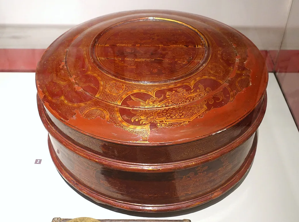
Vietnamese lacquer painting developed by asking what lacquer could do as a painting medium. The answer was not limited to gloss. The National Gallery Singapore describes a field of contrasts: translucency and opacity, roughness and sheen, surface and depth.
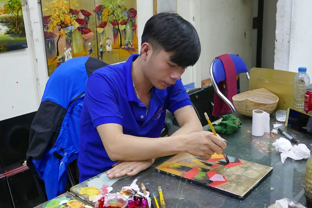
Natural lacquer, or sơn ta, had been used in Vietnam for centuries. A lacquer studio opened at the École des Beaux-Arts de l’Indochine in Hanoi in 1927, and lacquer became widely used for painting from the 1930s. Artists made the medium part of the image through layering, inlaying, sanding and polishing.
Those material operations created a recognizable set of visual relationships. Darkness could hold light rather than merely surround it. Gold could read as atmosphere. A pale inlaid fragment could define a hand, face or glint on water. Sanding could make an earlier layer reappear inside a later one.
Contemporary printed art cannot reproduce that material behavior. It can study the relationships and rebuild them with different tools.
What travels from lacquer into print
A limited palette with strong internal contrast
Lacquer-inspired design often works with a small family of colors: black, deep red, dark green, warm gold and ivory. Limitation creates coherence. One bright line can carry more weight because the surrounding field is restrained.
Light that seems embedded in the scene
A conventional highlight can sit on top of a form. Lacquer-inspired light often appears to come through the image. In print, this impression can be built with layered tonal transitions, reflected bands and small high-contrast marks.
Surface pattern that carries meaning
Crackle, eggshell-like fragments and mosaic motifs can mark water, stone, sky or ornament. They should support the subject rather than cover it with a generic texture.
Negative space as a material presence
Large dark areas give bright forms room to act. A black sky can make an aged-gold bridge feel suspended. A dark river can turn one pale reflection into the emotional center of a landscape.
A slow path through the image
Lacquer rewards looking from several angles and distances. A print can echo that tempo by withholding small details, repeating motifs and guiding the eye from a broad dark field toward a few concentrated highlights.
Three Vietnamese places, three different translations
AE&Adamas currently uses this visual language in three landscape prints. Each begins with a licensed photograph of a real place. AI image tools support the artwork under human creative direction and review. The selected image is then prepared for printing. The result is an interpretation rather than documentary reproduction.
Tràng An: quiet light moving across water
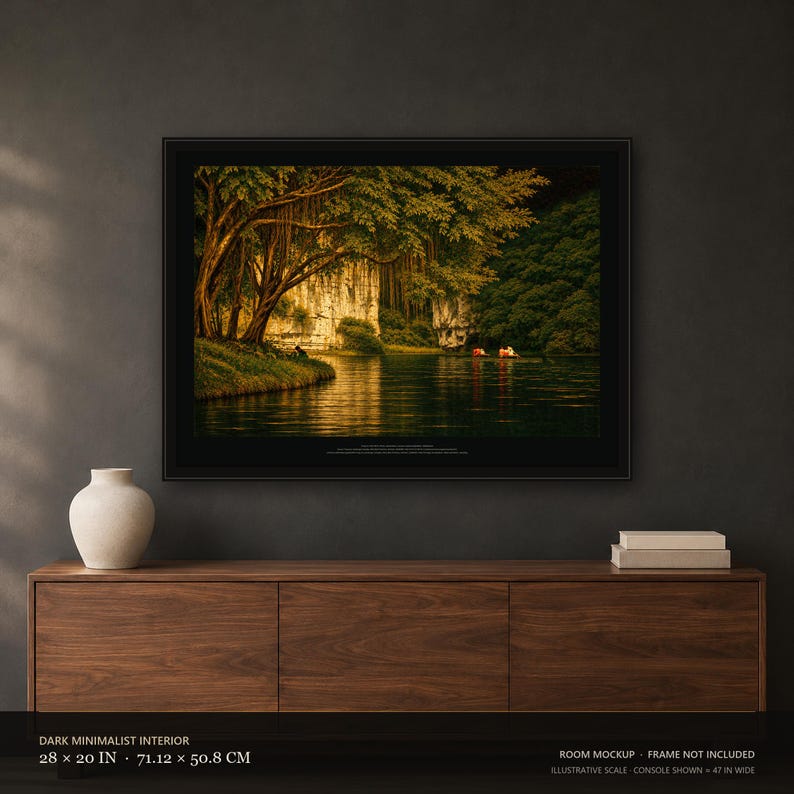
The Tràng An landscape offers a natural sequence of layers: water, boats, trees, limestone and sky. Vietnam Tourism describes the area through cave systems, jungle-fringed waterways, hidden valleys and limestone arches.
In the Tràng An · Ninh Bình print, listing 4618612557, the composition keeps the photographed arrangement of a broad canopy, pale cliff, calm water and two small boats. Dark jade and black compress the foliage into a deep frame. Aged-gold reflection opens a path across the water. Ivory patterning makes the cliff appear to hold light.
The design decision is not “make the scene look old.” It is to let a few illuminated passages emerge from a controlled dark field. That relationship recalls lacquer’s surface-depth tension.
The physical item is a 28 × 20 inch unframed print on 189 gsm matte paper. Its gold, crackle and eggshell-like features are printed color and pattern.
Hà Giang: scale organized around one green line
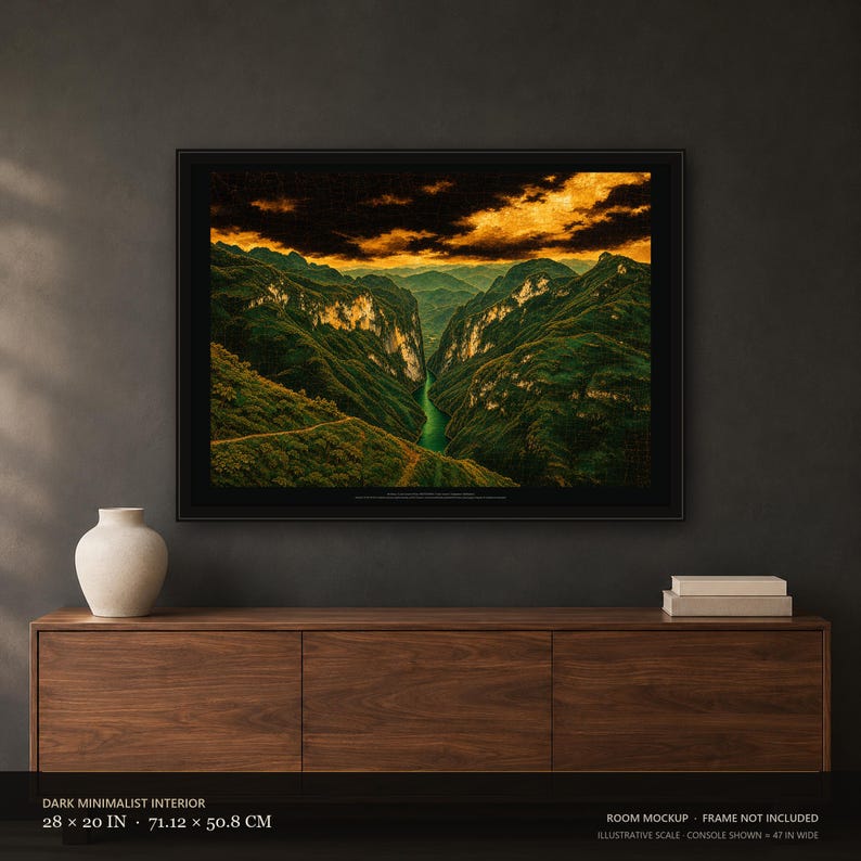
The Nho Quế River creates a narrow visual route through the immense rock forms below Mã Pì Lèng Pass. Vietnam.vn, the information portal of Vietnam’s Ministry of Culture, Sports and Tourism, describes the emerald river winding through the deep gorge and identifies Tu Sản Gorge along the route.
The Hà Giang · Mã Pì Lèng print, listing 4617923067 turns the river into the central seam of the image. Dark mountain masses rise on both sides. Aged-gold sky broadens the scene above, while narrow light on the cliffs prevents the valley from closing completely.
Here the lacquer-inspired move is one of compression. Many greens become a limited dark-jade range. Rock, vegetation and cloud are separated by value and texture rather than by a naturalistic spectrum. The river remains legible because its green is isolated and continuous.
This is a flat 28 × 20 inch unframed paper print. It contains no real lacquer, gold leaf or raised texture.
Golden Bridge: architecture as a radiant band
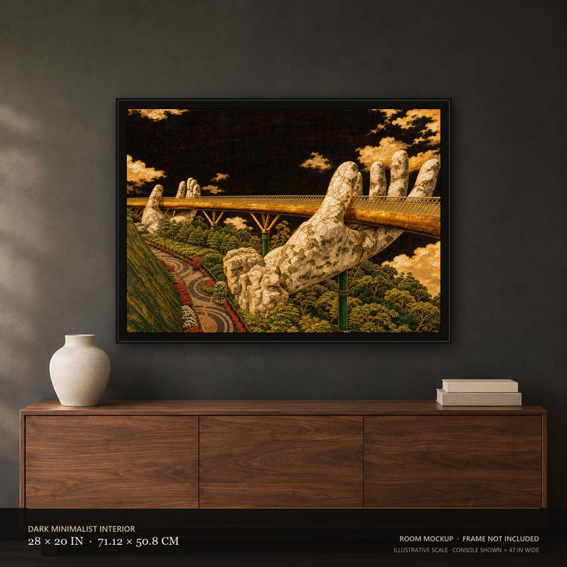
The Golden Bridge already has a strong graphic structure: a narrow walkway carried by monumental hands. In the Golden Bridge · Đà Nẵng print, listing 4616350880, the bridge becomes a long aged-gold band crossing a nearly black sky. Jade landscape sits below it. Pale hands break the line and turn support into the main image.
The composition uses darkness to simplify the surroundings and focus attention on the relationship between hand, bridge and forest. Fine crackle and mottled ivory detail help the hands feel weathered without claiming an applied eggshell surface.
The product is a 28 × 20 inch unframed print on 189 gsm matte paper. The listing gives the dimensions and the photograph credit.
The same visual language at the scale of a garment
A landscape invites the eye to move across a wide field. A garment graphic must read quickly at a smaller scale. The translation therefore changes.
The Christmas Tree Hoodie, listing 4617803280 reduces the palette to a lantern-tree form in jade, antique-gold color, ivory and vermilion. Black fabric supplies the dark field. Gold-colored outlines create continuity; ivory mosaic details work as small lights.
The Personalized Family Hoodie, listing 4619113002 adapts a related lantern-tree motif around a name or family role. The personalized text belongs to the garment’s social function, while the fixed motif keeps the group visually coherent.
Both designs are front DTG prints. The garments do not contain lacquer, gold, metallic foil, shell, mother-of-pearl or embroidery. The listing images are digital product or lifestyle mockups, and the personalized family listing sells one hoodie per order.
A responsible translation needs four layers of truth
1. Name the source tradition accurately
Vietnamese lacquer painting is a material art form. Its history and process should be explained through museum or institutional sources, not reduced to a mood board of black, red and gold.
2. Name the contemporary process accurately
AE&Adamas states that its artwork is AI-assisted under human creative direction and review. The production file is printed on paper or fabric by the disclosed production partner. This is part of the artwork’s history and should remain visible.
3. Name the product accurately
A print should state its dimensions, paper and framing status. A garment should state its fabric, print method and what one order includes. Cultural context cannot substitute for a product specification.
4. Name what the object does not contain when confusion is likely
When an image uses pearl-like fragments or aged-gold color, a short material boundary protects the buyer: printed effect, not shell inlay or gold leaf. The clarification belongs near the visual claim, where it can be understood.
Inspiration is strongest when the differences stay visible
A contemporary print does not honor sơn mài by pretending to be a lacquer panel. It can engage the tradition more thoughtfully by studying how darkness, reflected color, surface pattern and selective light organize an image. It can then explain its own tools, sources and materials with equal care.
This makes the relationship more interesting. The viewer can see what traveled from one medium to another and what changed along the way. Material lacquer remains a demanding physical practice. The print becomes a record of visual interpretation: one Vietnamese place, one selected composition, one controlled palette, and a product format that is clearly named.
Explore the collection and the context
Begin with What Is Vietnamese Lacquer Painting? for the art-historical foundation. Use the visual reading guide to compare materials and disclosure. Current AE&Adamas product specifications are listed in Materials & Care, with live options and prices on each exact Etsy page.
Works in this article



Product facts: Etsy listings checked . Etsy shows the current price, options and delivery estimate.
Sources
- Vietnamese Lacquer Painting: Between Materiality and History — National Gallery Singapore
- Ninh Binh: A journey through golden valleys — Vietnam Tourism
- Touch the Nho Que River — Vietnam.vn
- The Golden Bridge, Ba Na Hills, Vietnam — Ray in Manila via Wikimedia Commons

These sources give cultural and geographic context. They do not describe how AE&Adamas products are made; product facts come from the dated Etsy catalog check.