Library
Lacquer Painting vs. a Lacquer-Inspired Print
You cannot authenticate lacquer from color alone. Use material, process and provenance to distinguish a lacquer painting from a print.
By AE&Adamas Editorial · Published
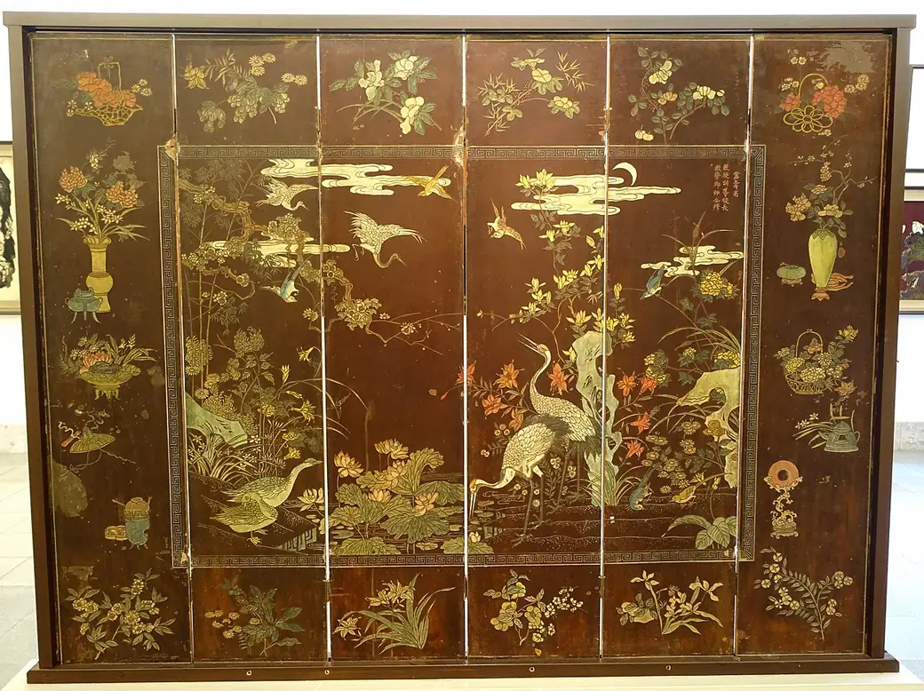
The reliable way to distinguish a Vietnamese lacquer painting from a lacquer-inspired print is to check the stated materials and process. A real lacquer painting uses lacquer as part of the artwork’s physical construction. A lacquer-inspired print uses ink or pigment to reproduce colors, sheen, crackle or inlay-like patterns on paper or fabric. Appearance alone cannot authenticate the medium.
This distinction does not require a judgment about which object is “better.” It identifies what each object is, how it was made and what a buyer should expect to receive.
Start with disclosure, not color
Black, vermilion, gold and jade can appear in a lacquer painting, a digital image, a poster or a garment. Simulated crackle can be printed. A photograph can flatten actual inlay into pixels. Lighting can make matte paper look glossy and a glossy coating look deeper than it is.
Begin with five questions:
- What is the support: board, wood, paper, textile or something else?
- Is lacquer named as a physical material or only as an inspiration?
- Does the maker describe layering, sanding, polishing or inlay as actual production steps?
- Are gold, eggshell and mother-of-pearl listed as materials or as color effects?
- Is there enough information about maker, medium and provenance to support the claim?
If the description only says “lacquer style,” “lacquer look” or “inspired by lacquer,” treat that as an aesthetic statement until the materials say otherwise.
A side-by-side reading checklist
- Medium statement Lacquer: Names lacquer as an applied material. Print: Names paper, ink, pigment, DTG or another print process.
- Physical process Lacquer: May describe layered lacquer, inlay, sanding and polishing. Print: Describes digital design, image preparation and printing.
- Surface Lacquer: Material depth and sheen can change with angle and light. Print: The image may depict depth, crackle or metallic color on a flat substrate.
- Gold or pearl Lacquer: May identify actual gold, silver, eggshell or shell in the individual work. Print: Usually identifies gold-colored or pearl-like printed detail.
- Maker information Lacquer: Artist or workshop, date, technique and support should be documented. Print: Designer, printer or production partner should be disclosed.
- Provenance Lacquer: Ownership, exhibition, gallery or workshop records may matter. Print: Exact product listing and production specification matter.
- Buyer expectation Lacquer: A material artwork or lacquered object. Print: A paper print or printed garment.
These are evidence categories, not a remote authentication test. A photograph cannot confirm what lies inside a surface. Valuable or historic work should be examined and documented by a qualified specialist.
How to read the visual language without confusing it with the medium
The visual vocabulary of lacquer can travel beyond lacquer itself. Reading that vocabulary is still useful when the object is a print.
1. Dark fields act as active space
Black often does more than outline a subject. It can hold the composition together, separate bright passages and make colored forms appear to emerge from depth. In a printed interpretation, the same effect comes from tonal contrast rather than layers of lacquer.
2. Warm metallic color organizes attention
Gold-colored areas can guide the eye through a landscape, architecture or pattern. Ask where the brightest warm notes sit. They may define a horizon, catch the edge of a cliff or turn a line into the main rhythm of the image.
3. Jade and vermilion create a controlled palette
Dark green and red can work as structural colors rather than literal local color. A forest may be compressed into jade masses. Vermilion may mark a small figure, ornament or focal detail. The restraint of the palette helps the image feel unified.
4. Crackle and mosaic patterns suggest material history
Fine crackle, ivory fragments and iridescent-looking marks can recall aged lacquer, eggshell or shell inlay. In a traditional object, these may be physical features. In a print, they are visual information carried by ink.
5. Depth can be compositional rather than physical
A flat print can still create the sensation of layers through overlap, tonal bands, reflected light and repeated texture. Call this “layered-looking depth” or a “lacquer-inspired surface treatment.” Do not call it layered lacquer unless lacquer is actually present.
What traditional sources tell us to look for
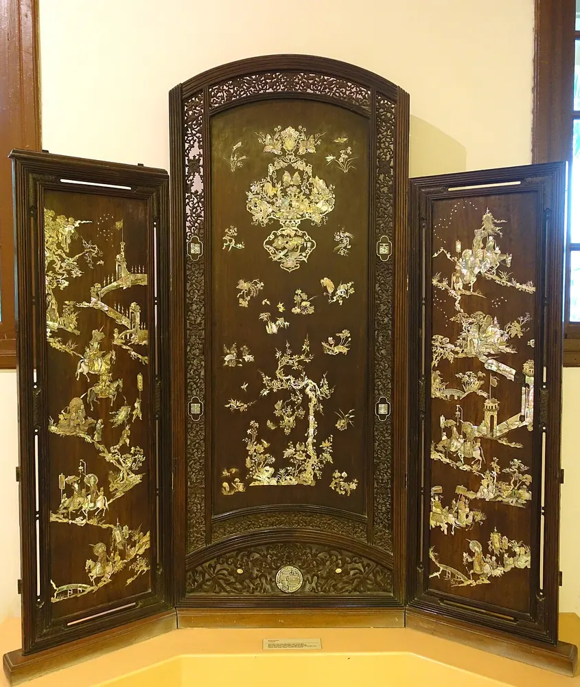
The National Gallery Singapore’s account of Vietnamese lacquer painting emphasizes translucency and opacity, roughness and sheen, surface and depth. It also describes an iterative process of layering, inlaying, sanding and polishing. These are material relationships, not a fixed palette that can be copied by choosing red, black and gold.
The official Vietnam Tourism rural portal provides a similarly concrete description of mother-of-pearl inlay at Chuôn Ngọ. The documented stages include drawing, sawing the shell, carving the receiving surface, embedding the pieces and polishing. A printed mosaic motif can refer to this play of line and light, but it is not shell inlay.
Try the checklist on paper and fabric
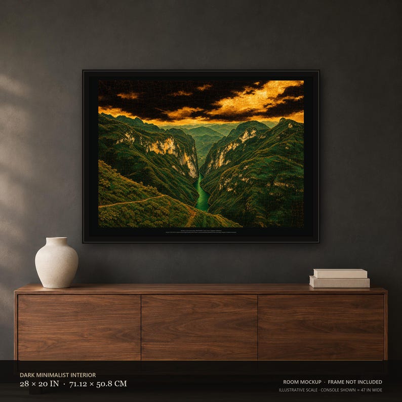
The Hà Giang print shows fine crackle and an aged-gold sky. Its material line tells you what creates those effects: one unframed print on 189 gsm matte paper. The river and cliff shading can suggest depth without a physical layer of lacquer or gold leaf.
The Lanterns of Home hoodie has pale mosaic-like marks and antique-gold colored details. Its description names direct-to-garment (DTG) printing, and its material line identifies cotton and polyester. The pale details are ink rather than shell. Each purchase is one printed hoodie; the family images show how several garments might look together.
A safe product-description formula
Writers and sellers can keep the distinction clear with four parts:
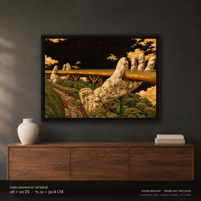
- Name the real object. “A 28 × 20 inch unframed print on 189 gsm matte paper.”
- Name the visual reference. “Inspired by the palette and layered-looking light of Vietnamese lacquer painting.”
- Name the production process. “AI-assisted artwork under human creative direction, printed to order.”
- State the material boundary. “The lacquer, gold and inlay appearances are printed effects.”
This formula gives the cultural reference room to be explained while keeping the product specification unambiguous.
Questions to ask before buying
Does “lacquer-inspired” mean the product contains lacquer?
No. The phrase normally describes an aesthetic relationship. Confirm the materials in the individual product description.
Can a flat print have a lacquer-like appearance?
Yes. Color, tonal contrast, simulated crackle, inlay-like pattern and controlled highlights can create a lacquer-inspired appearance. The effect remains printed on the stated substrate.
Does a gold color mean gold leaf was used?
No. Look for a material statement that explicitly names gold leaf or another metal. “Gold-colored,” “aged-gold color” and “metallic-looking” describe appearance.
Why does provenance matter for a printed landscape?
The source and license record clarifies the source image, license and changes made during adaptation. For the current AE&Adamas landscapes, each listing identifies a licensed source photograph and states that the photographer does not endorse the product.
Where can I check the current AE&Adamas materials?
Use the Materials & Care guide, then open the exact Etsy listing for current options, price, availability and delivery information.
Works in this article


Product facts: Etsy listings checked . Etsy shows the current price, options and delivery estimate.
Sources
- Vietnamese Lacquer Painting: Between Materiality and History — National Gallery Singapore
- Chuon Ngo nacre inlays — Vietnam National Authority of Tourism
These sources give cultural and geographic context. They do not describe how AE&Adamas products are made; product facts come from the dated Etsy catalog check.